Updated on 9 November 2026 by Nicolas Finet, CEO of Sortlist. This guide has been rewritten for UK advertisers in 2026: it covers billboard formats and sizes (6-sheet, 48-sheet, 96-sheet, digital), seven design tips with the seven-word guidance from Outsmart practitioners, artwork specifications and the rules that apply to posters.
A billboard is seen for a few seconds, usually by someone in motion. Good billboard design is therefore about restraint: one idea, very few words, strong contrast and a clear brand. This guide shows how to design posters that work.
Key takeaways
- Keep copy short: practitioners citing Outsmart, the UK OOH trade body, often give seven words or fewer as the sweet spot.
- The standard UK roadside format is the 48-sheet, about 6.1 m wide by 3.05 m high; the 96-sheet is about 12.2 m by 3.05 m.
- Digital screens now account for about two-thirds of UK OOH revenue, so plan creative that works in motion and in short slots as well as in static form.
1. Determine the type of billboard you want
| Type | Description | Design implication |
|---|---|---|
| Directional | Roadside signs guiding people to a nearby business | Name, distance or direction in very large type |
| Traditional (static) | Printed posters on standard frames: 6-sheet, 48-sheet, 96-sheet | Bold, simple layouts; fixed artwork |
| Digital (DOOH) | Screens showing rotating ads | Short sequences; works with other advertisers in the loop |
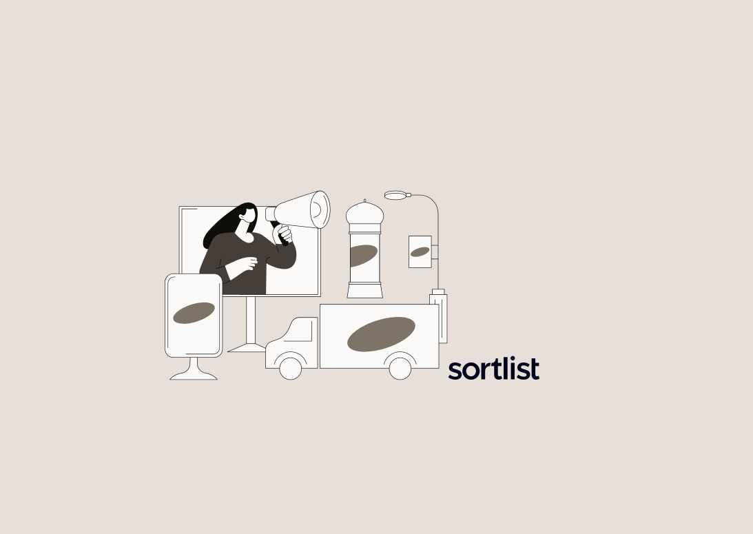
| Mobile billboards | Vehicles carrying advertising | Readable in motion, from the side and rear |
| Painted and bespoke | Hand-painted or large-scale installations | Strong, simple images and long lead times |
| 3D and special builds | Extensions and sculptural elements | Need engineering, planning and cost |
Typical UK sizes: a 6-sheet is the small street-level poster; a 48-sheet is 20 feet by 10 feet (about 6.1 m by 3.05 m); a 96-sheet is about 12.2 m by 3.05 m. Always get the exact specification from your media owner. For costs and planning, see out-of-home advertising.
2. Understand how people see billboards
Viewers have seconds, often from a moving vehicle, at distances of tens of metres. Design for that situation: large type, high contrast and a single focus. Test your layout by viewing it at thumbnail size, or from across a room.
Seven design tips
1. Use very few words
“The most effective outdoor ads use short, punchy messaging – with many industry practitioners citing seven words or fewer as the sweet spot for billboard copy.”
Priority Outdoor, What makes a good billboard design (citing Outsmart)
Choose the single message that matters. Cut anything that is not needed: lists of features, legal text that is not required and extra slogans.
2. Make the brand obvious
If viewers do not know who the ad is from, it has failed. Place the logo large enough to read and in a consistent position. Use brand colours and distinctive assets.
3. Use one strong image
A single, simple image works better than a collage. Choose pictures that read at a glance: faces, products and bold graphics. Avoid fine detail that disappears at distance.
4. Choose high-contrast colours and legible type
- Large, simple, bold typefaces; avoid thin, script or condensed styles.
- Strong contrast between text and background; avoid text over busy imagery without a solid panel.
- Limit to two or three colours.
- Check accessibility: contrast for colour-blind viewers matters too.
5. Give it a clear call to action
Offer one next step: a short web address, a brand name to search or a location. Do not expect phone numbers or long URLs to be remembered by drivers. Search is how many people follow up, so make the brand name searchable.
6. Use context and location
Mention the place or situation ("Next exit", "Open until 10pm", the local neighbourhood) and use digital screens to adapt to time, weather or events. Be sure that this is accurate and compliant.
7. Design for the format
- Static: use the exact trim, bleed and safe zones the supplier requires, and design for the frame's proportions.
- Digital: design for the screen's dimensions and a short dwell (often several seconds), with a clear final frame. Simple animation can help, but do not let it obscure the message.
- Mobile and vehicle: keep text large and avoid small details.
Artwork specifications
| Item | What to check |
|---|---|
| Dimensions and bleed | Supplied by the media owner for each format |
| Resolution | Large formats are viewed from a distance, so lower resolutions are used than for small print; follow the printer's specification |
| Colour mode | CMYK for print; follow screen specifications for digital |
| File type | Press-ready PDF for print; image or video files for digital with specified formats and file sizes |
| Safe zone | Keep key content away from edges |
| Fonts | Outlined or embedded |
Ask your supplier for templates before you start designing.
Rules and good practice in the UK
- CAP Code: claims must be truthful and substantiated; ads must not cause serious or widespread offence.
- Restricted categories: alcohol, gambling, food and drink, and financial products have additional rules. Transport for London operates its own policy on less healthy food and drink advertising. See UK ad complaints.
- Placement near schools: particular scrutiny applies to age-restricted products.
- Planning consent: large formats need local authority advertisement consent, which the media owner usually arranges.
- Price claims: prices must be clear and accurate.
Examples of what works
- One image and one line: a product pack shot and a few words.
- Typographic posters: bold type on a solid colour with the logo.
- Playful local references: short messages that rely on the setting.
- Sequenced messages: on digital screens, a short sequence that builds a simple story.
Measure the results
Track branded searches, direct traffic, enquiries and footfall during the campaign. Use unique search terms or codes in the poster. See how to create an advertising campaign, and for creative principles graphic design in advertising.
Frequently asked questions about billboard design
How many words should a billboard have?
About seven or fewer is often cited as the sweet spot by outdoor practitioners.
What size is a 48-sheet billboard?
About 6.1 m wide by 3.05 m high (20 by 10 feet).
What colours work best on billboards?
High-contrast combinations in two or three colours, with large, bold type.
Should I include a phone number or URL?
Keep the call to action very simple. A short web address or a searchable brand name works better than long details.
How do I design for digital billboards?
Follow the screen specifications, keep sequences short and make the final frame clear.
Do billboard ads need approval?
They must comply with the CAP Code, and large formats need planning consent, usually handled by the media owner.
Planning an outdoor campaign? Post your project on Sortlist and compare UK advertising and design agencies for free.
Sources: Priority Outdoor, billboard design, One Day Agency, 48-sheet billboards, Picture Sizes, billboard dimensions, The Media Leader, OOH revenue. Always confirm specifications with your media owner.